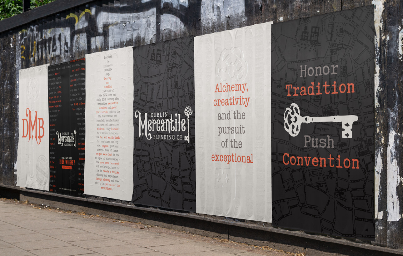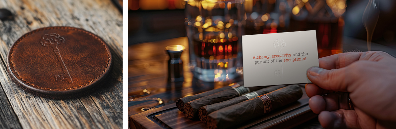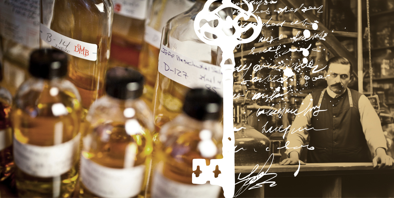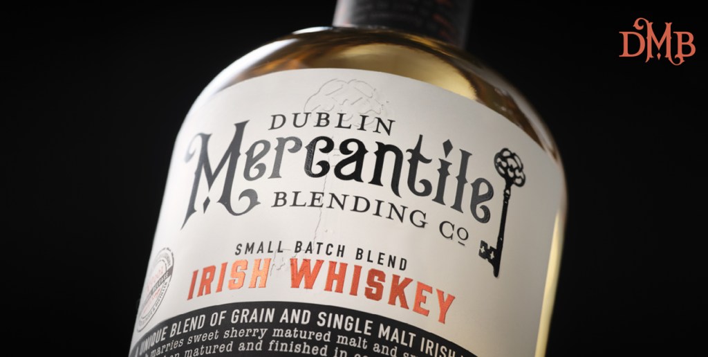
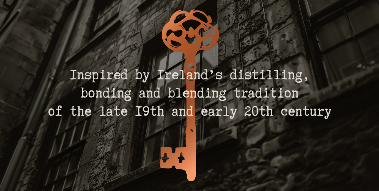
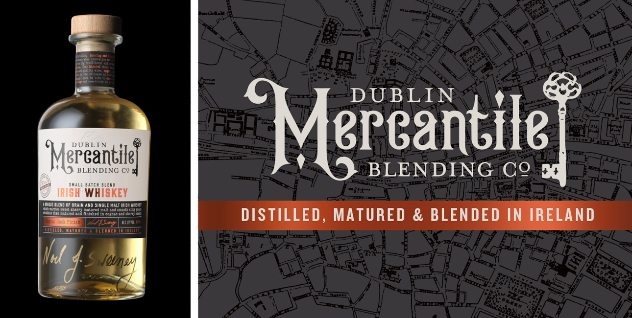
The period-driven typography grounds Mercantile firmly in that proud, rule-bending era. The brand takes ownership of an old-fashioned key as its primary visual equity, suggesting imagery of apothecaries and alchemists with their little locked drawers of mysterious elements that together were used to blend magical concoctions. The key becomes an invitation to unlock something special–the ingredients, the secret doors to where the bootleggers conducted their business, the backrooms where whiskeys of every sort were blended to perfection. True to the idea of an inspired blend, the label itself is a thoughtful mix of techniques and finishes–a screen-printed wordmark brings a tactile, raised feel to the lettering; an embossed key brings depth and interest; and copper foil links to the pot stills where whiskey is traditionally distilled.
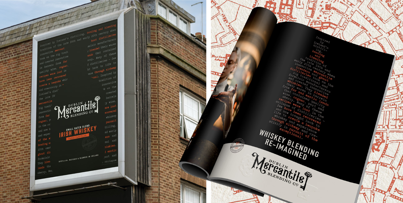
The brand’s story is presented on the neck label as a mystery to be decoded. As with the undercurrent of that era, its message is hidden in plain sight. Beyond the package, the brand’s look and feel extends easily to campaigns, including a launch teaser campaign that utilized elements of the package to arouse interest and curiosity, drawing people in closer and closer until the big reveal.

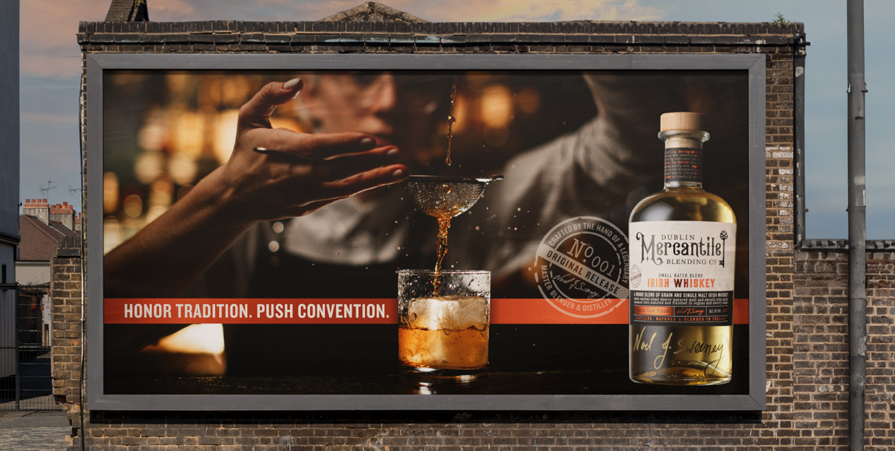
Honour tradition. Push convention. A new Irish whiskey emerges.