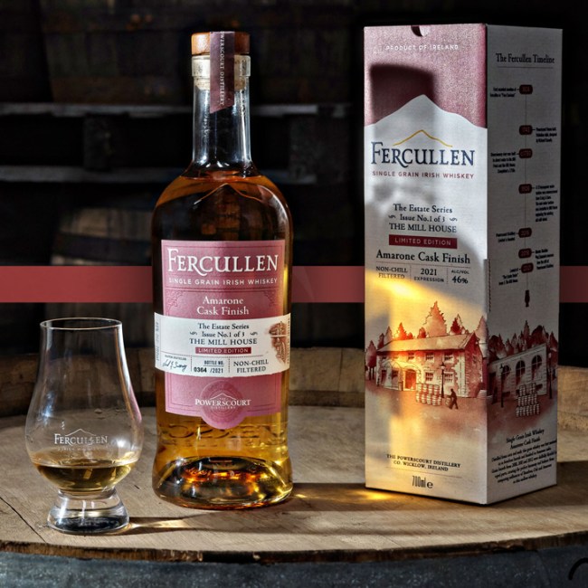
Design of the two captures the very spirit of the Wicklow Mountains. Inspired by the landscape, the labels include a die cut of Sugarloaf Mountain, Fercullen’s brand icon, while their texture and colors mimic the distinctive features – long green grasses and slate gray granite stones – of the beautiful, rugged Wicklow terrain.


The same attention to detail that goes into crafting these extraordinary whiskeys is revealed in the design. The paper stock’s coarse graininess is rich and natural. The raised Fercullen mark against the paper stock feels highly tactile and appears almost painted on. Embossing and sophisticated copper foiling can be found in the intricate Powerscourt seal and the Sugarloaf Mountain brand icon, bringing depth to both. The display boxes tell a further story, utilizing an interplay of matte surface, copper foil, gloss varnish, and silkscreen that delivers an elevated, sophisticated appearance. Details abound that bring richness to Powerscourt’s past and present. Together the two expressions establish a distinctive design architecture that families elegantly while making it easy to clearly and simply signal differences between expressions.


Since its launch Single Malt has delivered beyond expectations–on track to deliver over 20% of global case sales for the brand and helping to build awareness and engagement in the USA and global export markets.