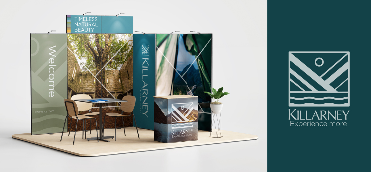
We first developed brand and creative strategies rooted in the multi-layered and timeless character of the place. “Depth” – a strategy that brought attention to the experience of time spent in Killarney, where every view, every path, every bend in the road, and every conversation with a local will reveal fascinating and intriguing layers. The strategy drove a distinctively atmospheric and immersive look across a cohesive 360° brand world, with choiceful use of visceral photography and a modern, fresh color palette inspired by the distinctive light and landscape of the world-famous park and its lakes. The new Killarney wordmark’s contemporary crafted styling is accompanied by a symbol built from the letter “K” to represent key pieces of Killarney’s distinctive landscape, providing an invitation to look closely and discover the layers for oneself.


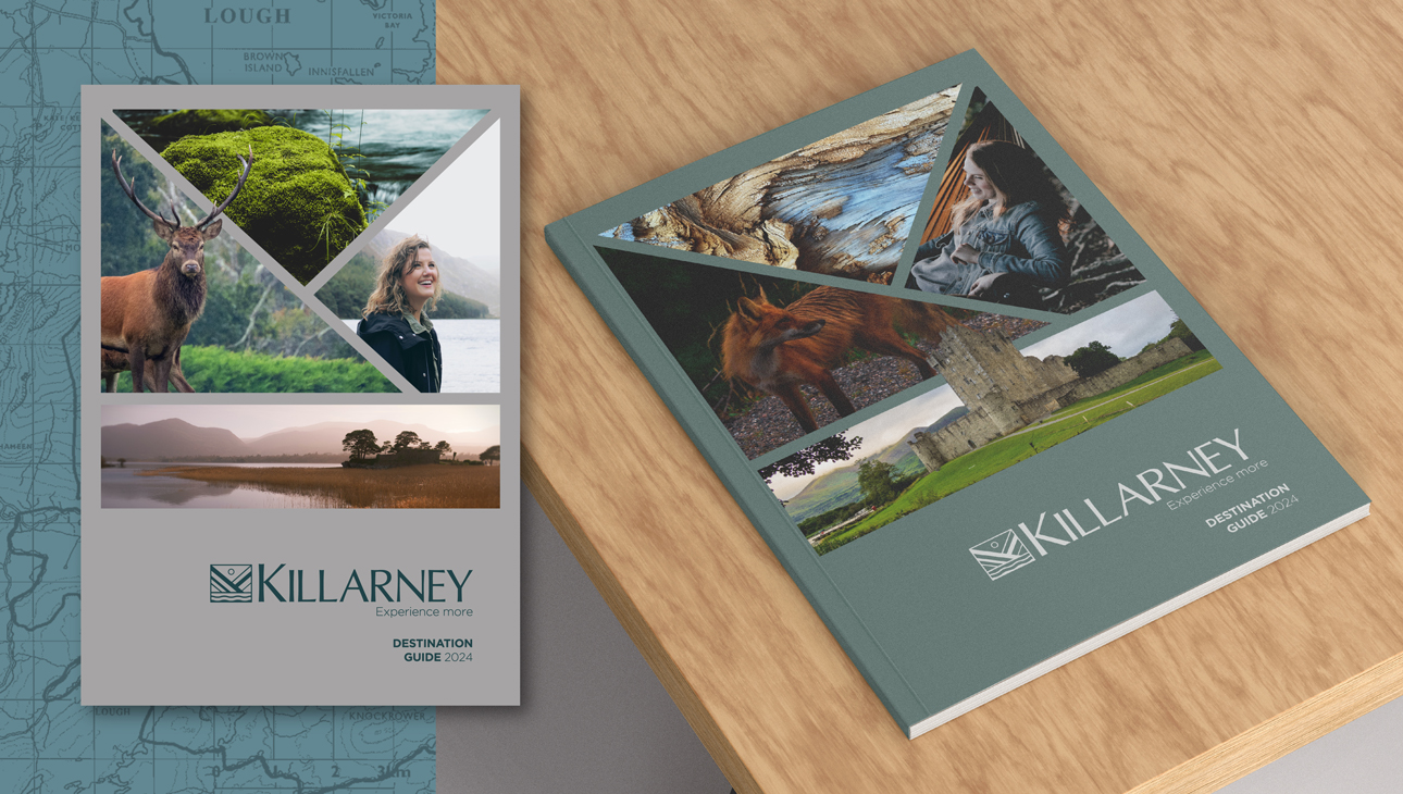
Overwhelmingly positive results from global visitor research.


