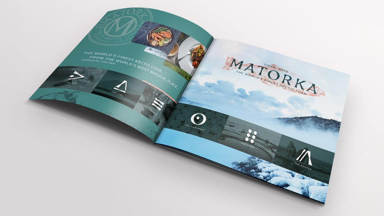

The new identity system celebrates the brand’s unique Icelandic story and its world-class fish. The sophisticated letterforms are distinctly Icelandic, expressed in a deep teal representing the combination of Iceland’s life-giving water and striking landscape. The brandmark’s textural arctic char imprint is inspired by Matorka’s hand-raising of the fish and its associations with Gyotaku, the ancient Japanese printing art of printing fish that is both an art form and a scientific illustration. Placed together with the established date in Icelandic and the tagline claiming the best possible quality, the brandmark brings to life the brand’s strategy of “The world’s best Arctic char. From the world’s most magical place.” The icon system inspired by ancient Icelandic symbols, the quality seal, and a distinctively raw and stunning photography style extends the brand world for an identity system as immersive as the brand itself.