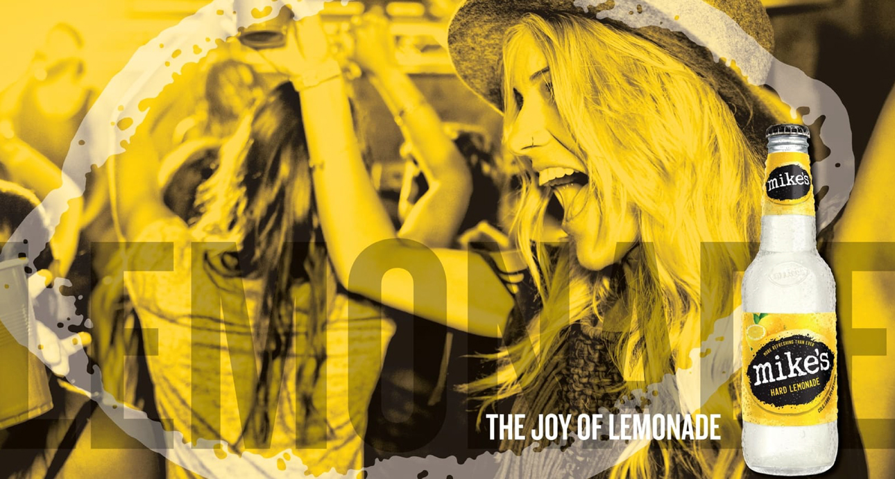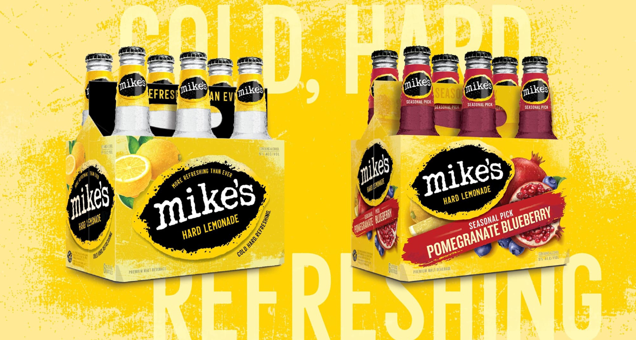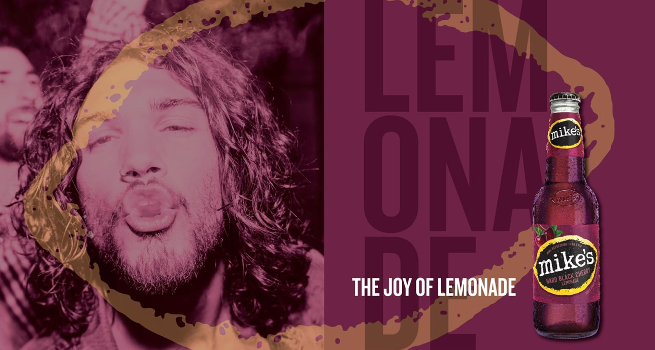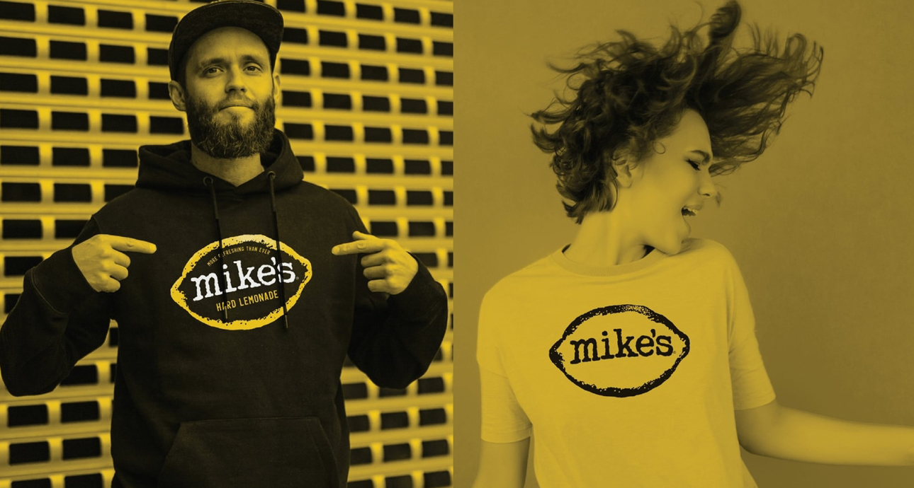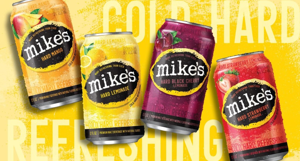
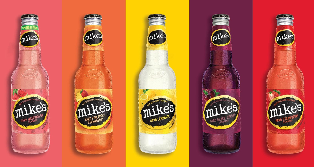
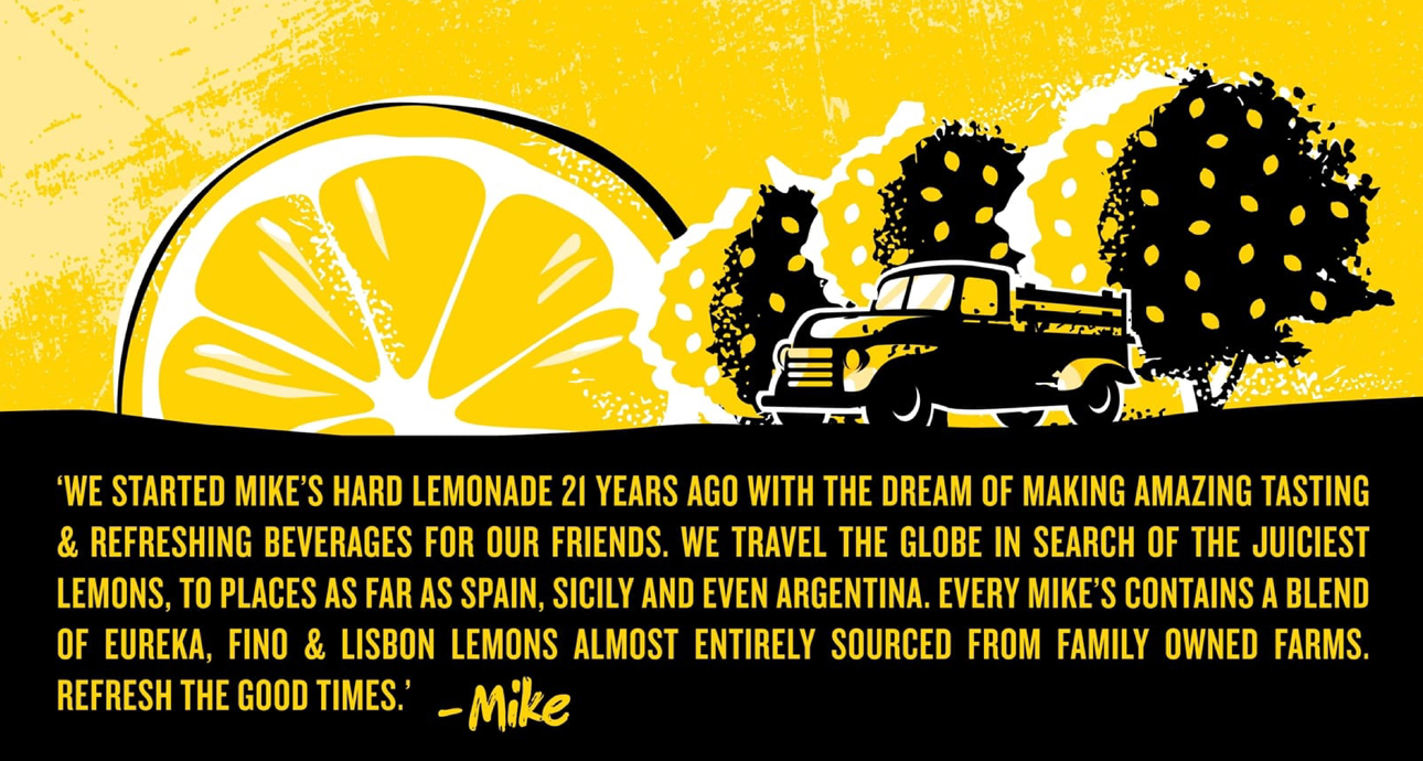
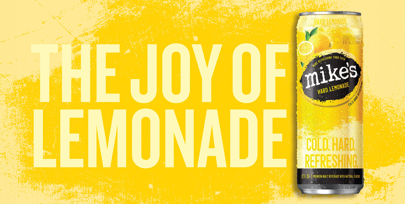
Trinity developed a brand strategy centered on Mike’s origins. “The Joy of Lemonade” became the brand’s promise to consumers, driving visual and verbal expression, as well as innovation to build back a powerful and cohesive leadership brand. The design embraced Mike’s equity in yellow and black to drive a bold foundation in line with Mike’s personality. To bring in the joyfulness and refreshment of fresh lemonade, we then brought in a cleaner, brighter and more natural visual approach, including freshly picked fruit illustrations and natural textures. We introduced a flexible overarching packaging system architecture to relaunch the Seasonal offerings that added some flare to the brand while retaining the core of Mike’s look and feel.
Achieved incremental growth of 15%, strengthening its position as the #3 brand in the RTD category.