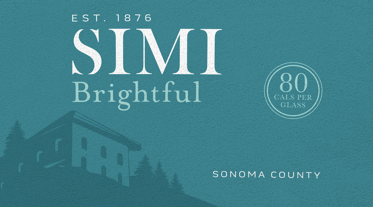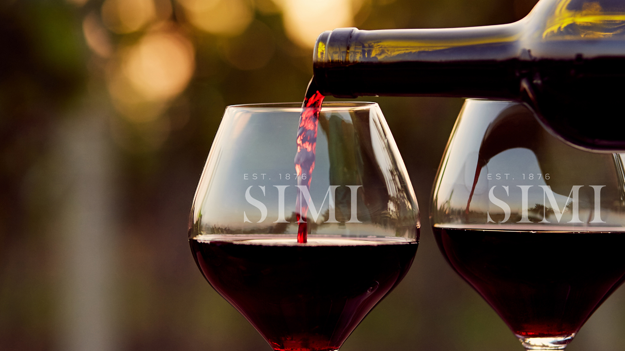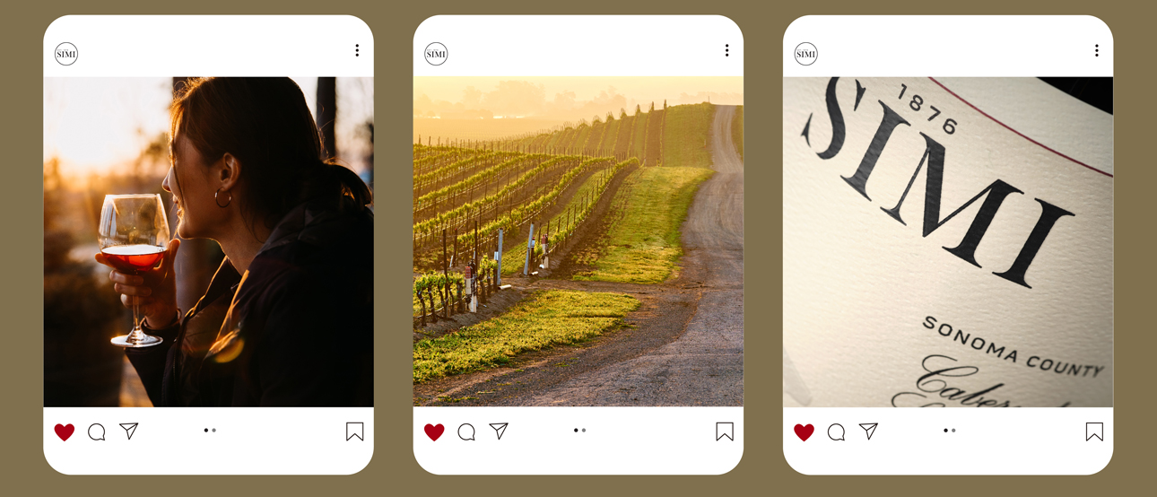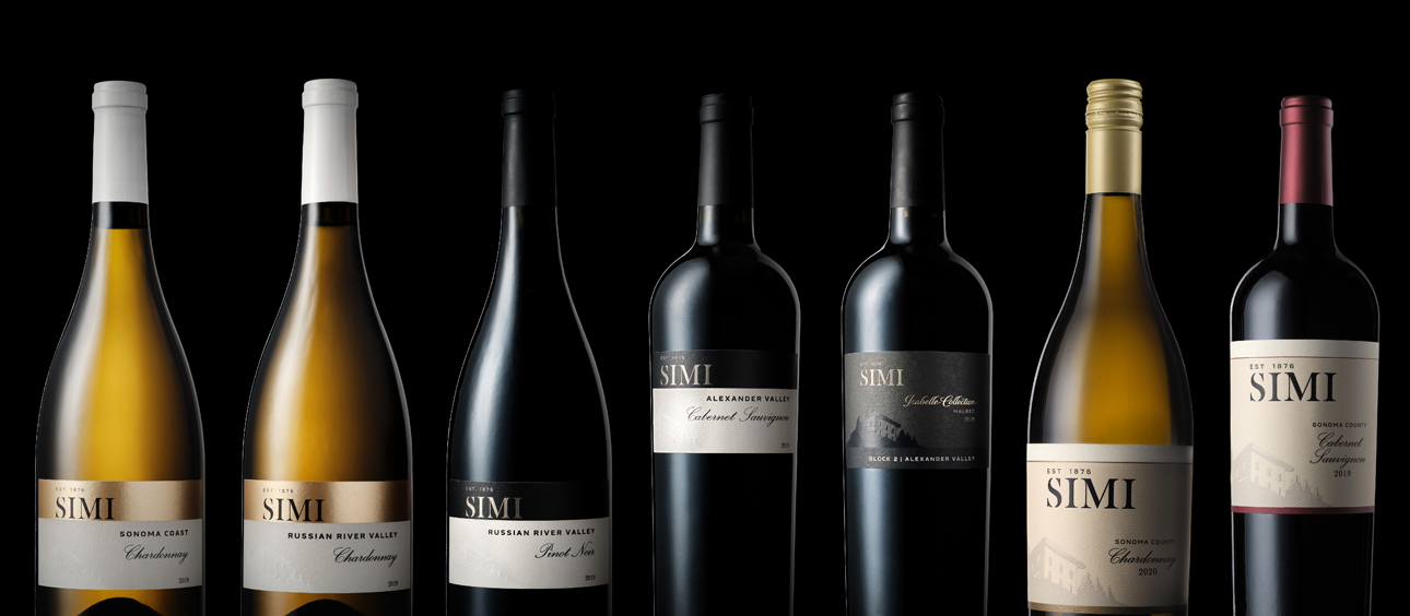
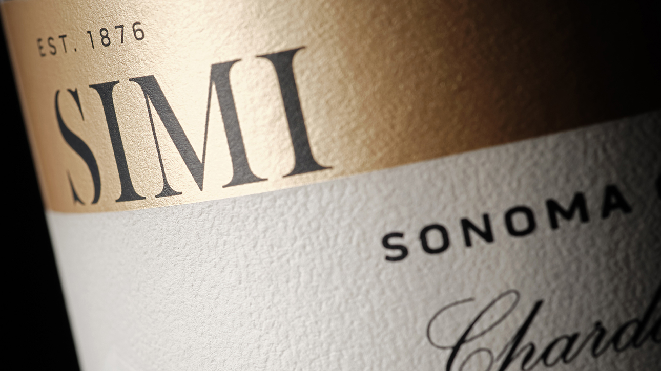
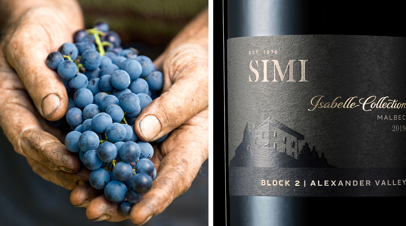
The new design system brings forward SIMI’s distinctive heritage story using a thoroughly modern expression. Off-center architecture and generous negative space combine to deliver an elevated and modern sensibility. Classic typography and an understated, elegant brandmark locked up with the brand’s established date bring timelessness to SIMI’s heritage. The tiers are distinguished from one another through color, paper stock and print techniques. Confirming the new look delivers on strategy, consumer research achieved high scores for “worth paying more for.”

Recaptured share of mind with both consumers and retailers