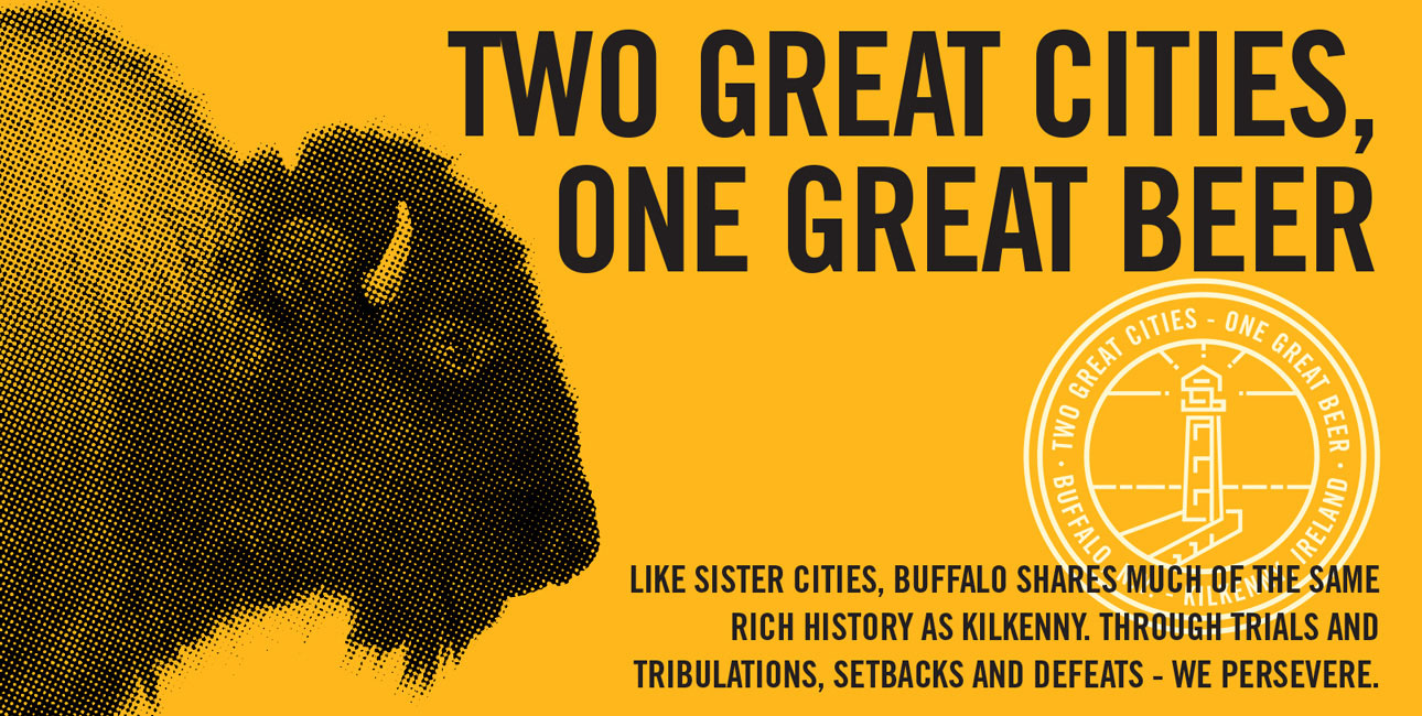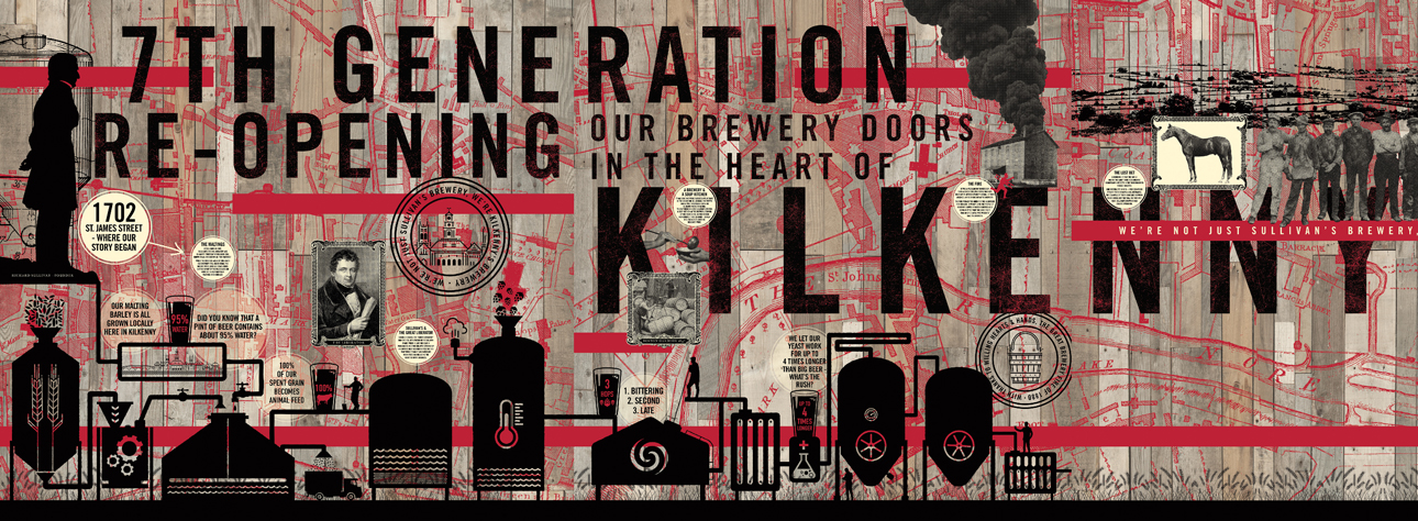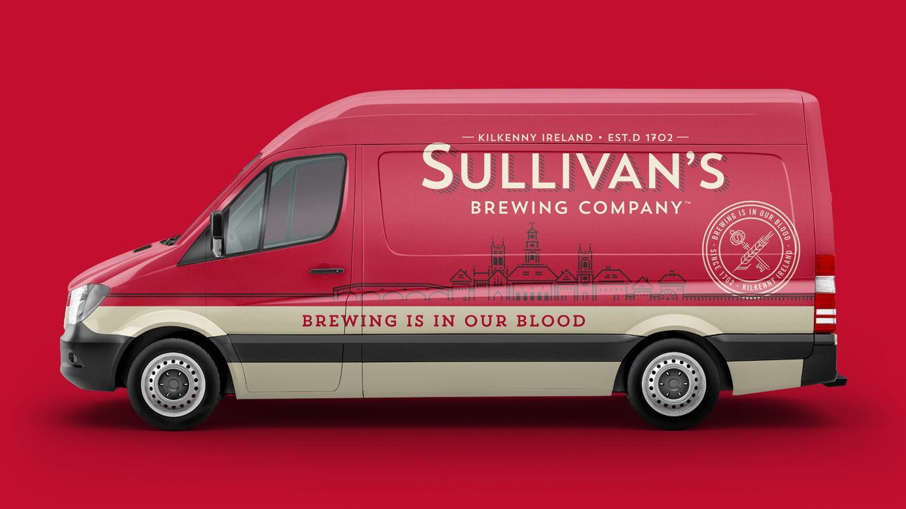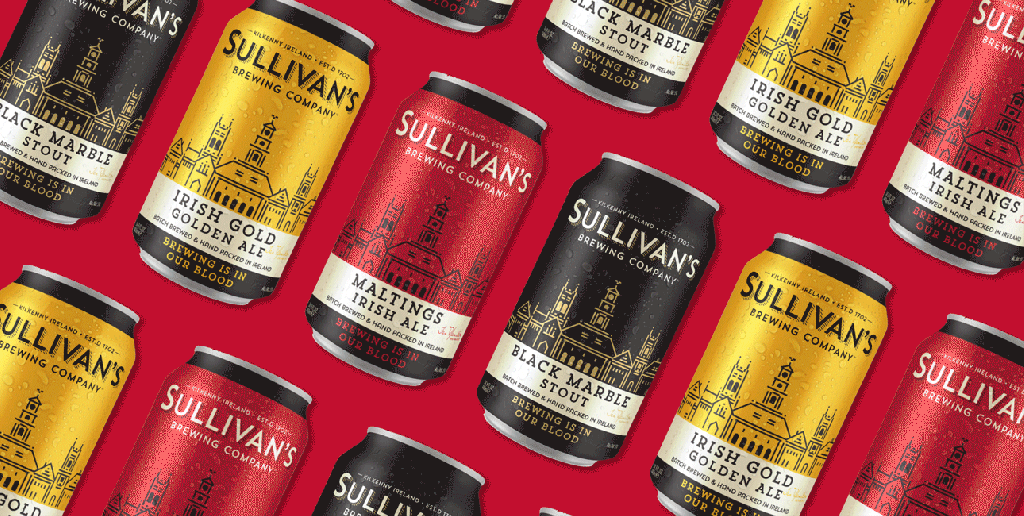
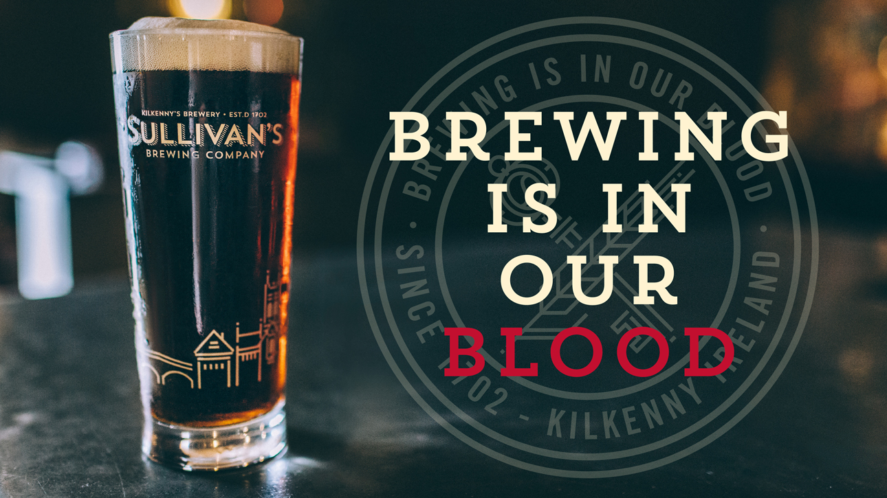
Trinity first developed the brand strategy ‘Kilkenny’s Brewery’ to convey the brand’s roots and pride in its home and community. The strategy serves as the driving force behind everything the brand does. Design celebrates the city and spirit of Kilkenny, with a strong nod to its past and a complete embrace of its future. The wordmark, with contemporary letterforms inspired by traditional Irish pub signs, includes the place and established date to drive home the interconnectedness of Sullivan’s with Kilkenny past and present. And the Kilkenny skyline captures the historical place and the sense of craftsmanship and artistry the city is known for.

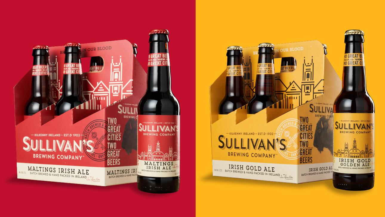
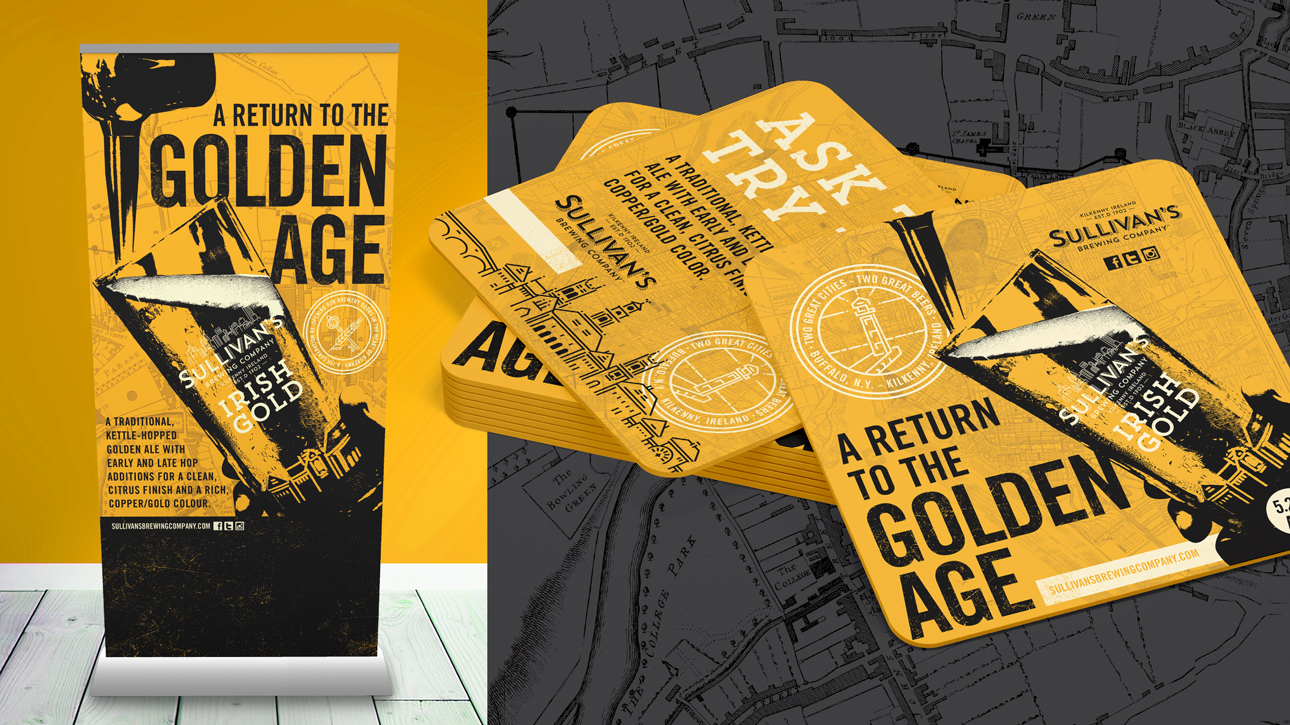
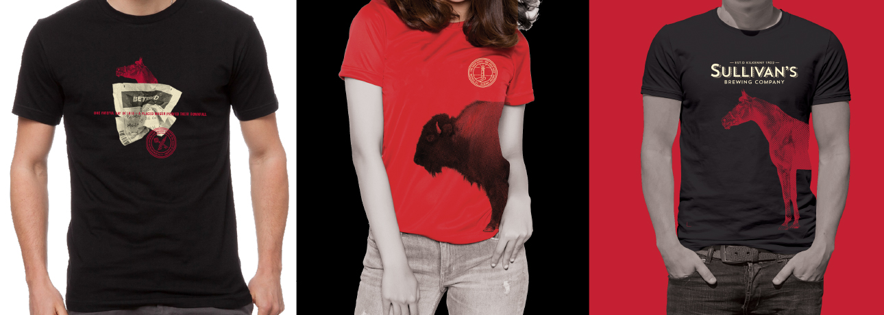
The (sky)line art also provides a secondary graphical toolkit for the brand that, with a flexible iconography system, a bold color palette, and even bolder secondary typography, we extended to an immersive taproom experience, custom posters, signage and merchandise, always used to tell the unique story of this historic brand.
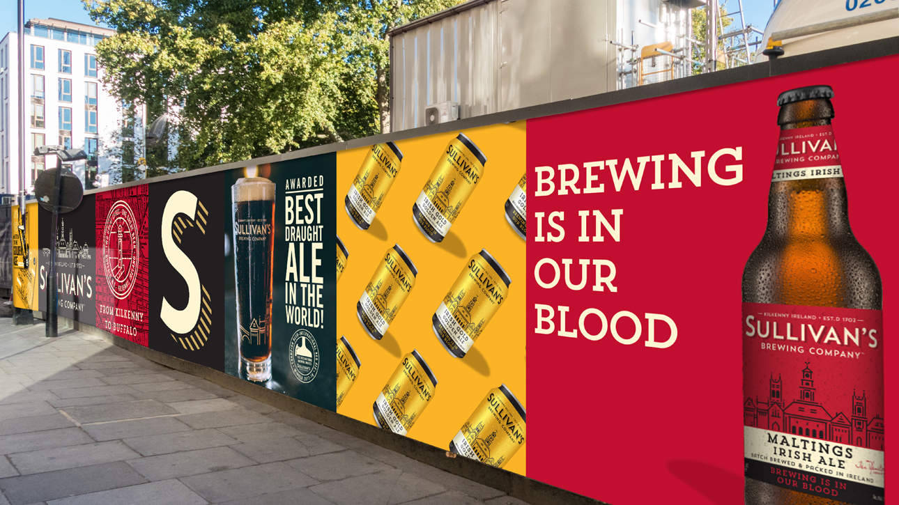

Since launch, Sullivan’s has expanded its portfolio and gained an expansive global distribution network - now in over 35 US states and in multiple countries across Europe.