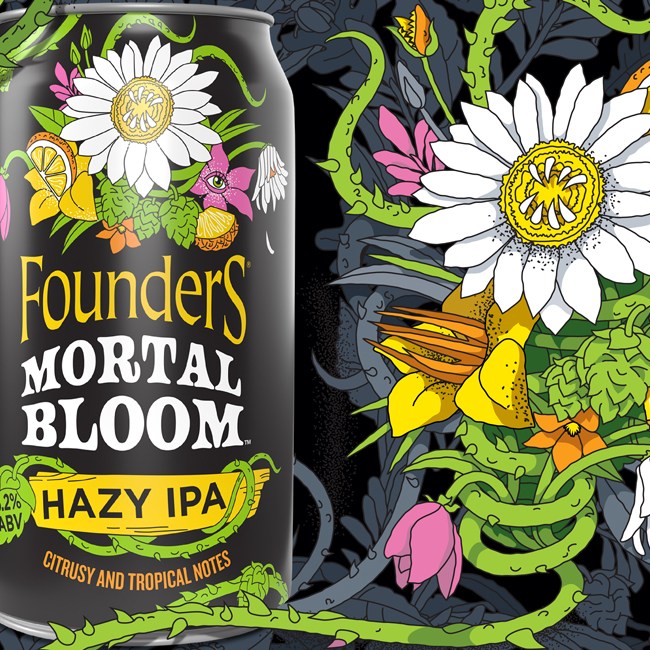

The design solution would need to balance WILD’s connection to the Jack Link’s parent brand, but signal loud and clear that this Gen Z-targeted sub-brand has a younger, wilder attitude. At the same time, as a platform for the brand’s activation, packaging would need to have longevity beyond its of-the-moment creative campaigns.

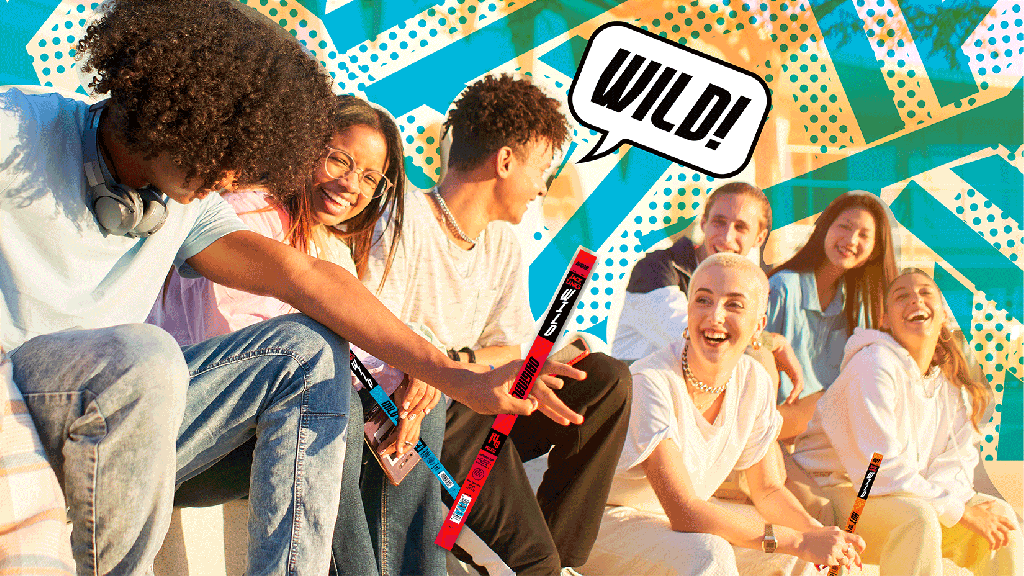
JL WILD’s fresh new look tells a story of a younger, livelier brand. There’s a bold, forward motion to the graphics and letterforms, a fresher, younger color palette, and a distinctive brand pattern plays off the idea of form (bars as meat sticks) and flavor (dots as pops of flavor). The versatile system is built to expand – to one-of-a-kind flavor innovations co-branding like the inaugural Dr. Pepper WILD Meat Stick, and to different packaging and media formats with a custom brandmark designed to work seamlessly whether it’s stacked or horizontal. The new JL WILD design system solves the ultimate challenge – grabbing attention and communicating what’s important to consumers, all on the most narrow of canvases.

The newly designed brand has made big moves right out of the gate, launching an unapologetically bold campaign that goes directly after their key competitor in the segment.