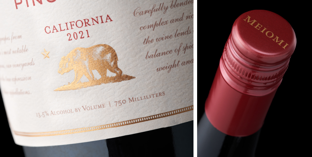
Trinity’s design solution focused on opening up space to create a more premium look and bring focus to the different varietals. Reducing the romance copy elevates by simplifying while centering the iconic California bear emphasizes the importance of the brand’s California growing region. Nuanced touches to the label frame and the bear increase premiumness and adding the varietal name to the closure further signals difference.

The evolved Meiomi design outpaced the higher-end wine segment in dollar sales and volume growth.

When it came time to innovate for the brand, we helped develop Meiomi Bright, a full-flavor lower-alcohol, and lower-calorie wine. The label design maintains cohesive equity with core packaging while strongly cueing the most important differences. “BRIGHT” is clearly displayed, a cream-colored closure suggests a lighter offering, and the % ABV and calorie count are prominently messaged in the same red type as the varietal – to create a clear link to the liquid.