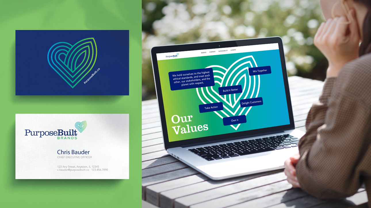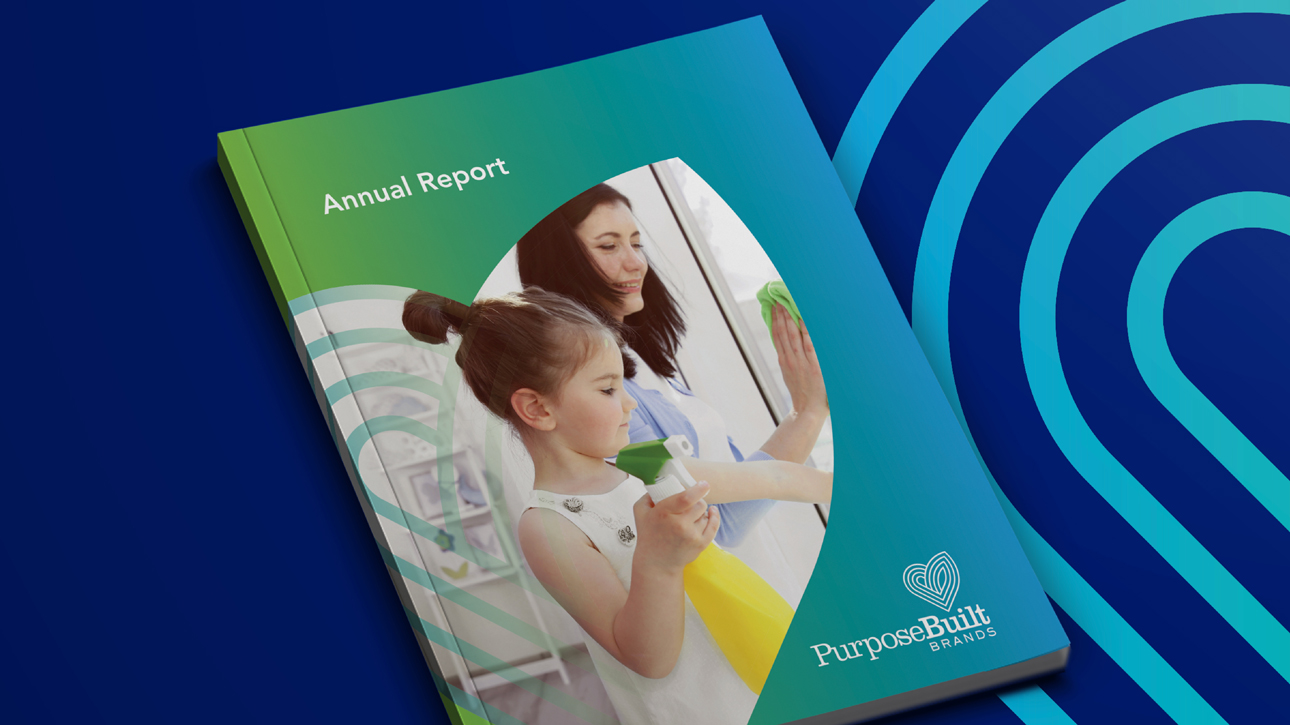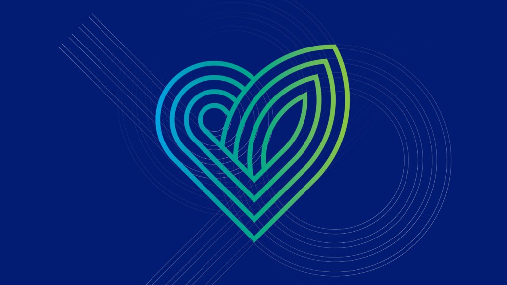
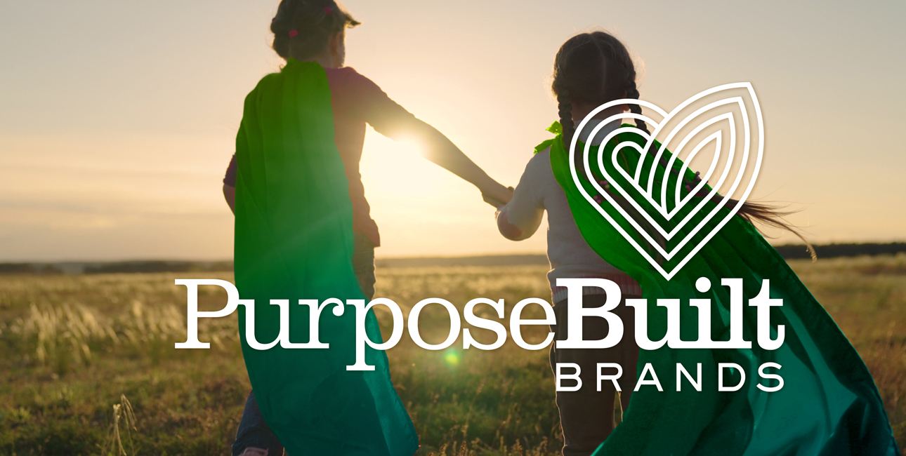
The new identity system balances the brand’s contemporary and forward-looking mission (PURPOSE) with its professional, hardworking expertise (BUILT). The wordmark is friendly and strong - with bespoke, two-weight letterforms grounded with ligatures that convey both balance and a strong foundation. The symbol includes layers to signify the multiple surfaces their portfolio of products works on and functions as a flexible design element to be used across communications. The friendly palette uses colors from nature that reflect the brand’s distinctive personality.


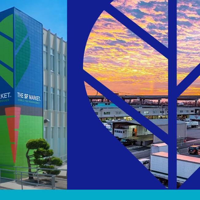
Rapidly expanded portfolio reach into retail brick and mortar.