Attracted more than $13 million in capital revenue for its upgrade and expansion project
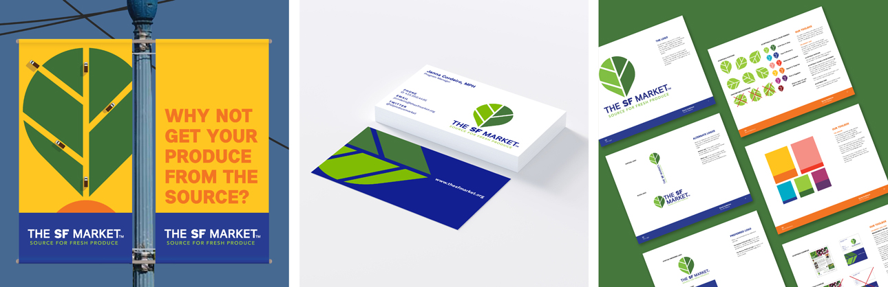
The new identity system vividly brings to life the market’s vital role in growing and sustaining a healthy, flourishing Bay Area. The logo strikes a balance between being a rock-solid, stable business, and letting the dynamism of the market shine through. Strong indigo letterforms make it clear this is a longstanding and important B2B marketplace, not a farmer’s market. And the leaf logo expresses both the vibrancy and centrality of the market. Working on many levels, the leaf is alternately an organic shape sprouting from the wordmark, a roadmap leading in and out of “SF,” or a topographical farmland landscape. Eye-catching murals, signage and wayfinding infuse The SF Market and its neighborhood with new energy and color.