Trinity first identified truths within dairy and the 110-year-old brand. Although a commodity, milk holds a powerful link to childhood and motherhood and their highly emotional associations around freshness, wholesomeness and nurturing. The brand also had a long history and a strong dairy farm presence in idyllic coastal Northern California. Combined, these insights led us to exciting areas for brand development.
We've been trying to crack this nut for over 5 years, and Trinity's design system nailed it.

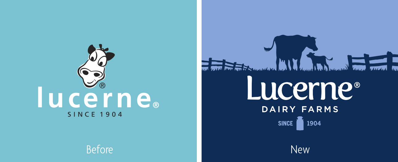
The brand strategy of “Celebrating Life’s Simple Pleasures” brings those insights to life and captures the charm of a place where it’s the simple things that matter most. We added “Dairy Farms” to the name to express authenticity - that there are real farms and a real place behind this storied brand.

Design then tells an authentic story, taking consumers momentarily to that place where life is unhurried and uncomplicated. The brandmark’s custom typeface evokes a balance of authority and personality. A milk churn bookended by “Since 1904” illustrates the brand’s long history of dairy expertise, and the white palette expresses fresh, simple wholesomeness. The shared moment between a mother and her calf reinforces the brand’s authentic sense of place and delivers an enduring innocent charm.


Significant increase in brand equity measures and basket sales

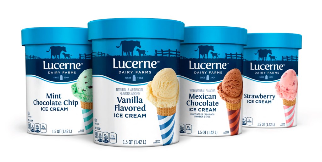
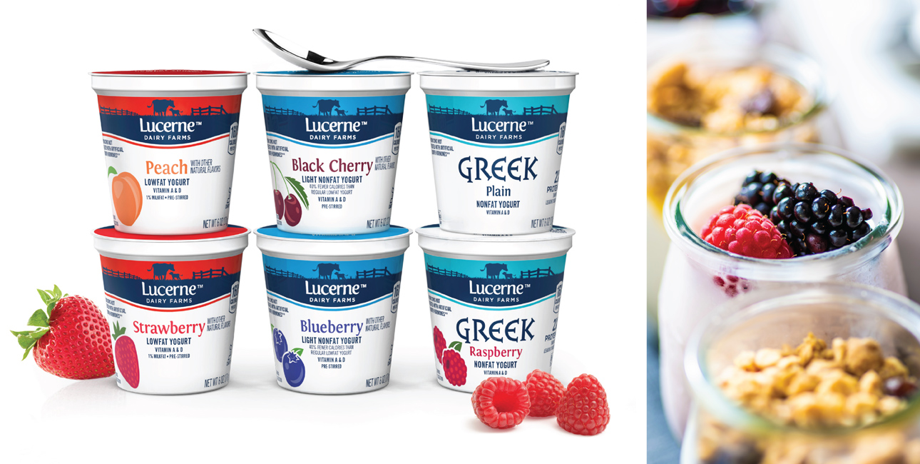
Meanwhile, the silhouette and its colored backdrop create a consistent, flexible design system that ensures the brand feels as right in the cheese aisle as it does in yogurt, milk and whipped cream. Seasonal and limited-edition SKUs include an extra delight – scenes reflect special details of the season like a snowy scene or falling leaves.

“Trinity’s design savvy helped us break barriers and create a timeless design system.”